Yes, you read right. It's apparently not Stockholmians (as we first thought), but Stockhomies. And we are back among them, enjoying the lengthening days and expensive coffee.
Some readers have asked for a few posts on H's and my immediate neighborhood. Happy to oblige. (There will be a few more posts forthcoming on the subject, so stay tuned!)
Notwithstanding Modern architecture's all-too-numerous utter and unassailable stupidities, it also lays claim to a few flashes of genius. Since Modern architecture was pretty much the first global architectural "style," one finds it everywhere. Stockholm as a city is perhaps unfortunate in that it seems to have acquired more than its fair share of Modern crap, but we're lucky in that one of the best early Modern designs lives about half a block from our apartment.


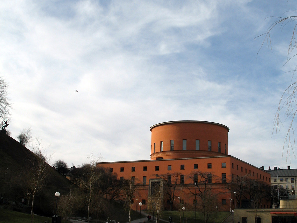
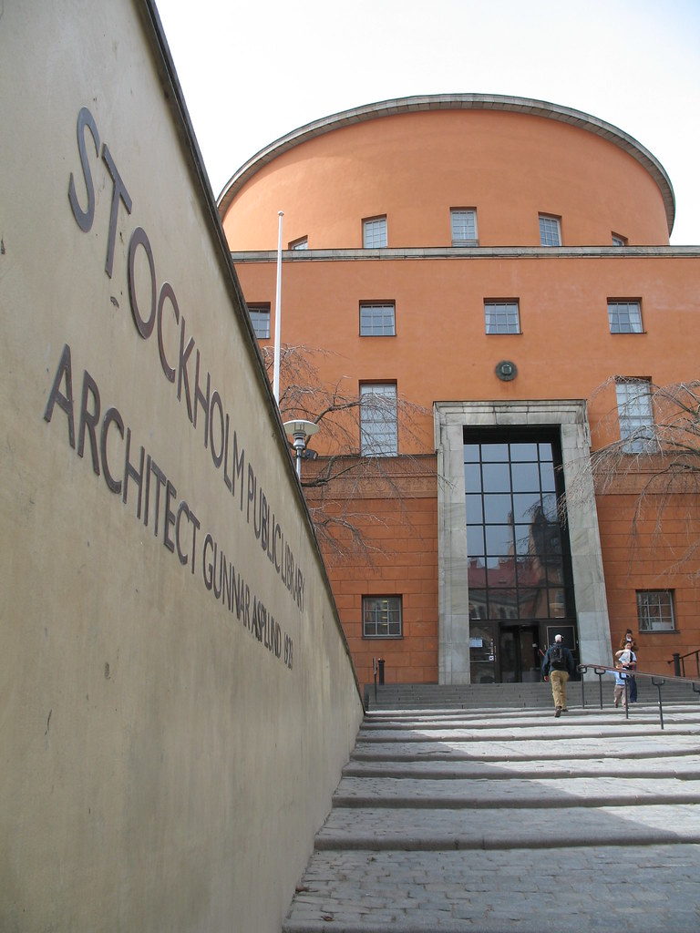
Half Prussian fortress and half wedding cake, the Stockholm public library inhabits the middle ground between civic authority and geometric whimsy.
Erik Gunnar Asplund's forward-looking design for Stockholm's city library
marks an architectural turning point, the more traditional classicism of the early sketches giving way to increasing simplification. The ornamentation was gradually pared down to a few pictorial friezes in bas relief. In the simple, glazed shopfront base completed in 1928, functionalism has already made its entrance.Apart from the building's historical import, it's extremely convenient to have it so close. H and I constantly raid the library's surprisingly substantial English language section, trawling for fun classics and the better best-sellers. (We've set up our own little "A-Store" on Amazon.com, so you can browse H's recent reads, J's faves, and other recommendations by clicking on the appropriate links over on the right sidebar.) While the inside of the library isn't up to the same standard as the outside (too much fluorescent lighting... blech!), the building still makes for a wonderful backdrop for our urban adventures.


No comments:
Post a Comment